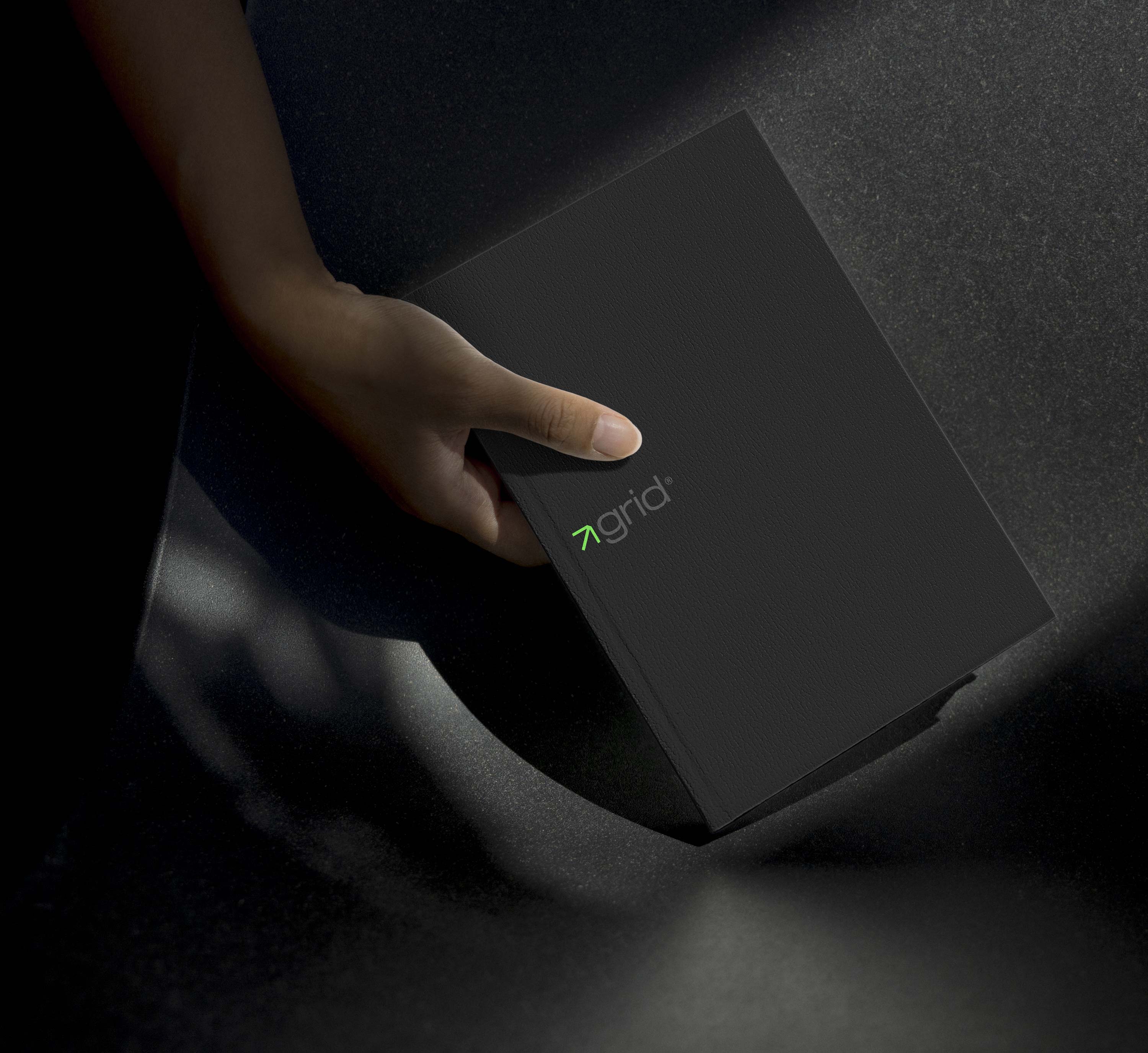


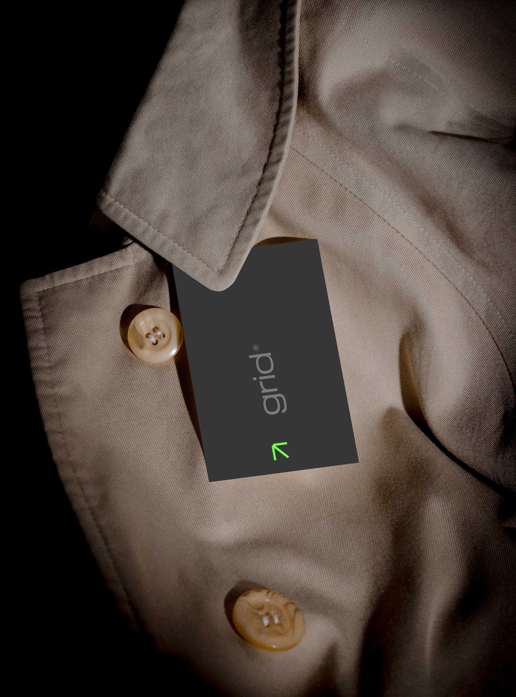
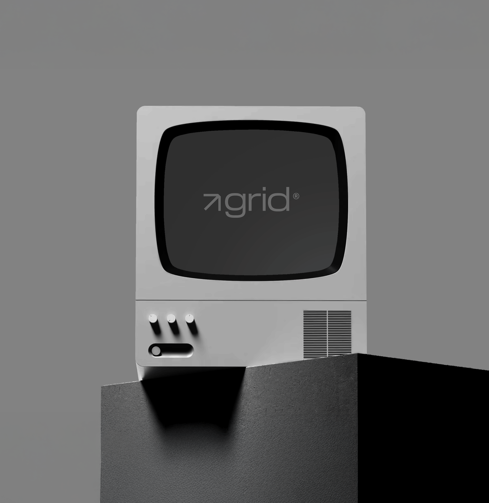
The logo centers around a sleek, custom wordmark and a northeast-pointing arrow—a subtle but deliberate nod to progress. This mark becomes a recurring motif across applications, reinforcing the idea of movement, direction, and vision. Combined with a futuristic typographic system, the identity leans modern without feeling sterile, designed to stand strong across both digital and physical spaces.

To capture Grid's ethos, we built a visual system anchored in contrast—pairing a bold green accent with a palette of industrial greys. The result is minimal, but not muted. The green symbolizes growth and innovation, injecting a fresh, dynamic energy into an otherwise refined and restrained identity. It’s a brand that feels both technical and alive.

Beyond aesthetics, the identity was built to scale with Grid’s ambition. From brand guidelines to motion behavior, every component was considered as part of a larger system—one that empowers the team to grow without diluting the brand. Whether it's on a prototype, a pitch deck, or the side of a machine, Grid's identity holds its ground—structured, intentional, and always moving forward.