











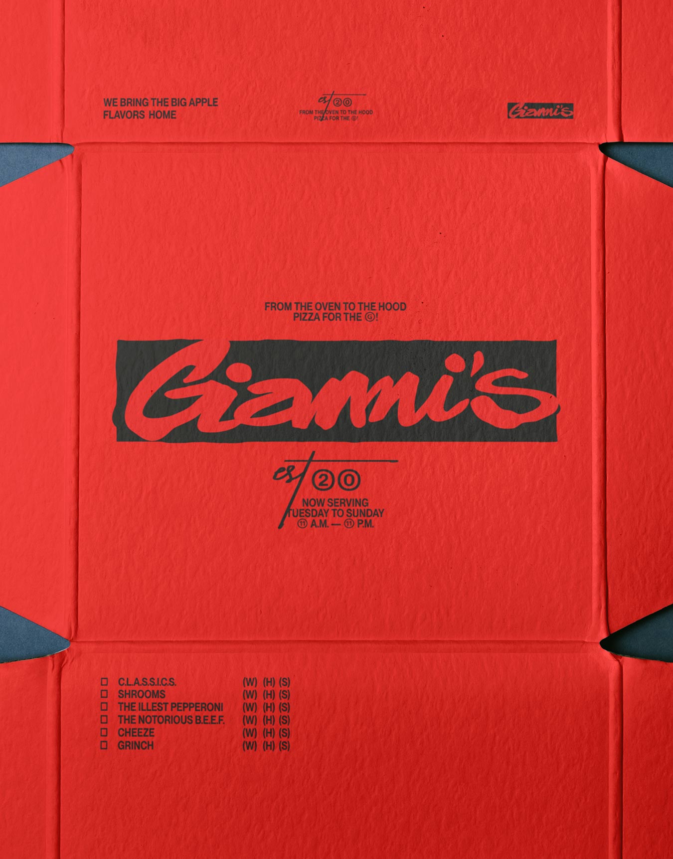
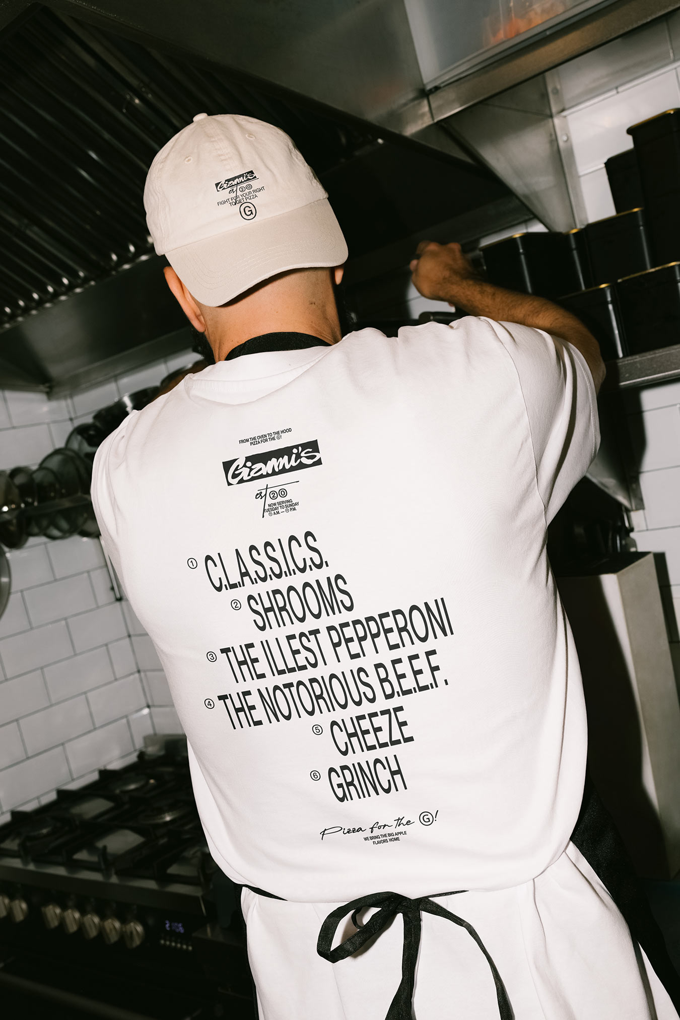
We built Gianni's around the raw energy of New York and its pizza culture: bold, expressive, and full of character. Red leads the identity, drawing on the rich color of pepperoni and the appetite that comes with a fresh slice. Paired with black and white, it gives the brand a direct, unmistakable presence, carrying the same confidence from the street to the table.
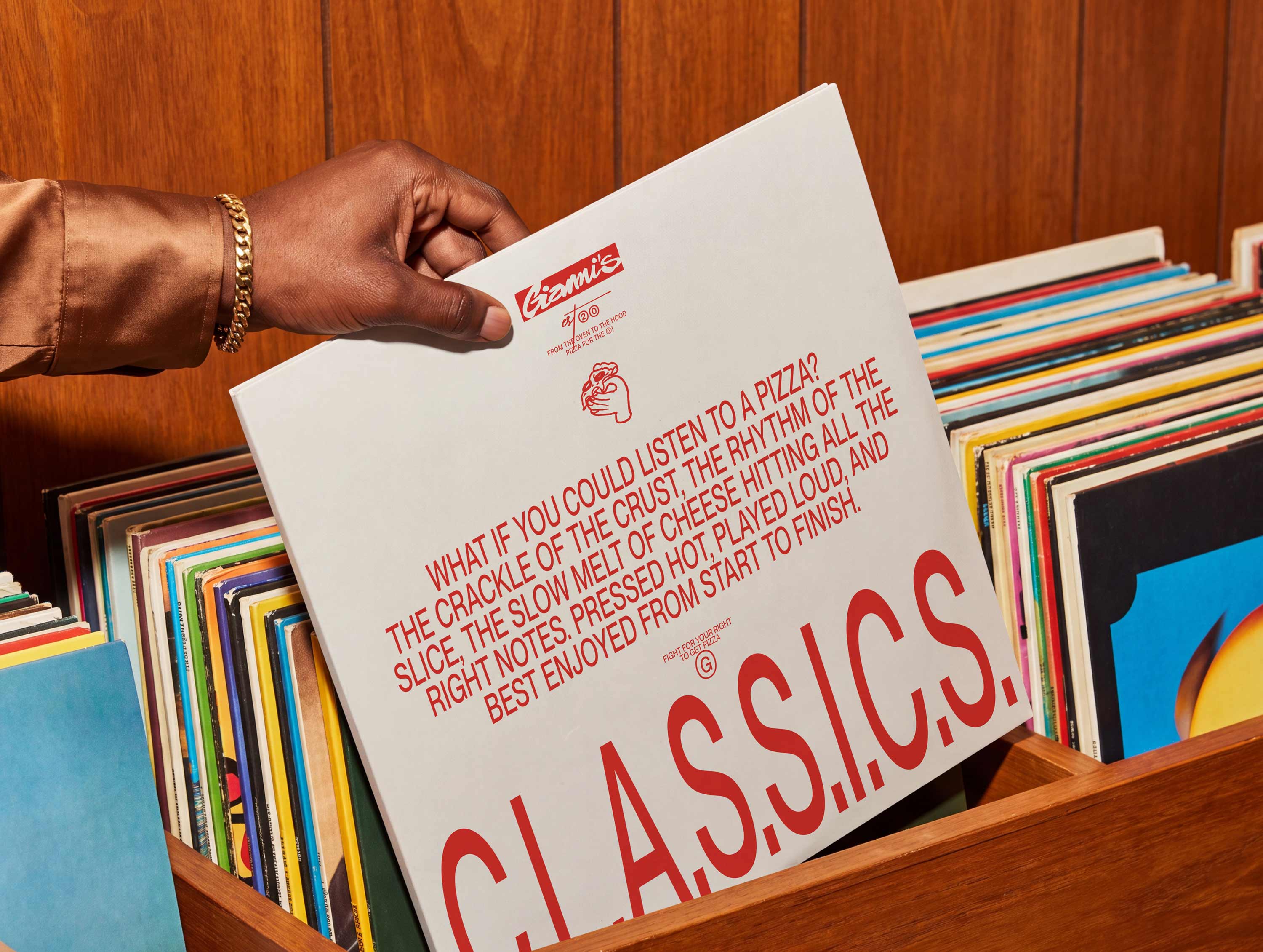
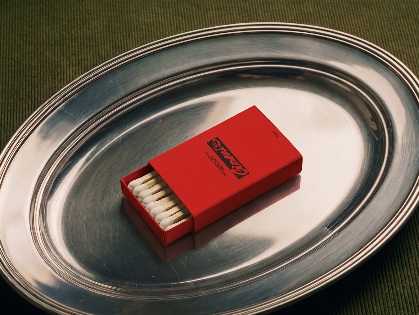
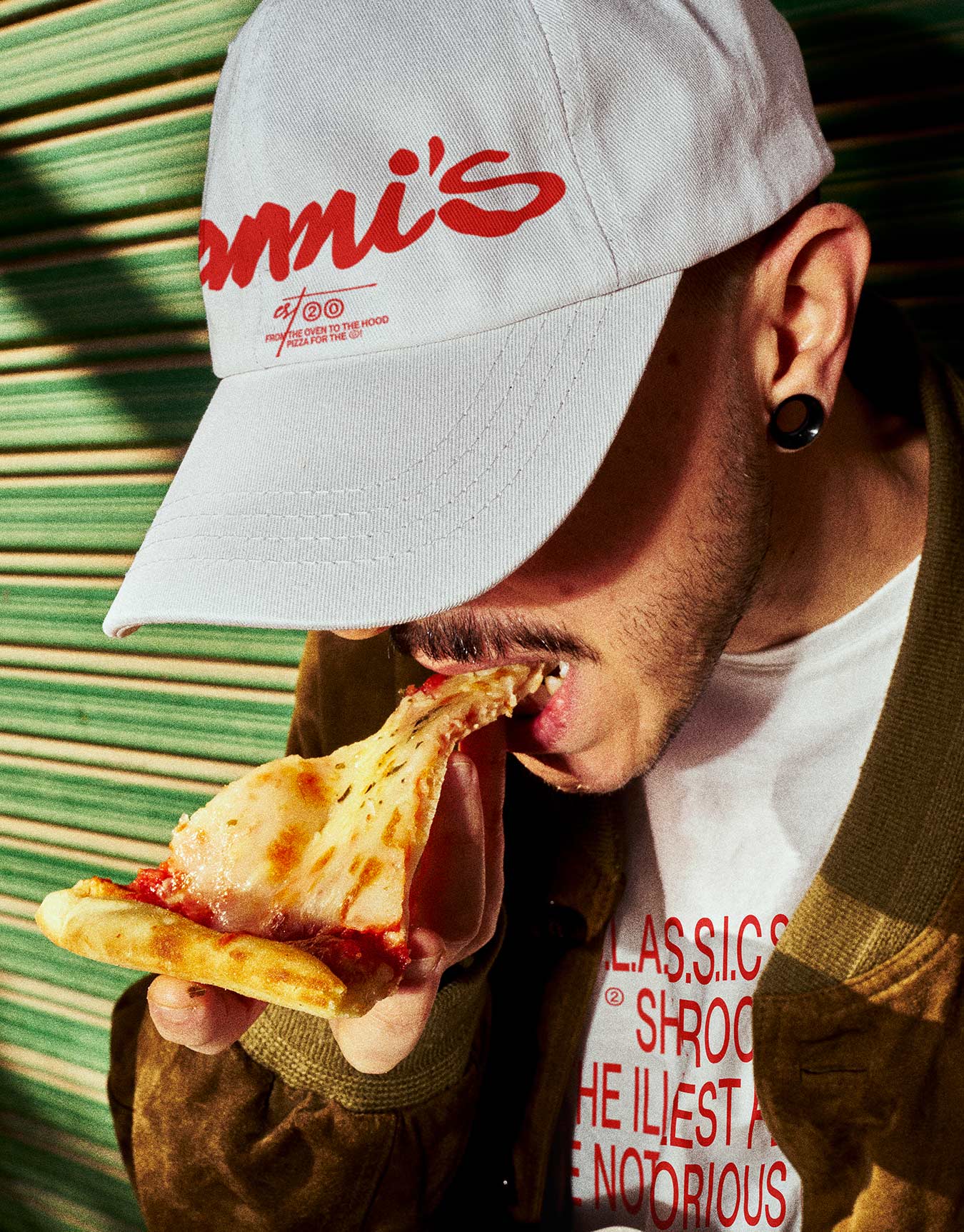
Handwriting and hand drawings bring the city's human texture into the visual system. Loose strokes and spontaneous marks draw on New York's street culture and the expressive spirit of hip-hop, giving Gianni's a voice that feels personal and alive. That rawness connects back to the food itself: fresh ingredients, hands at work, and the character that comes from making something from scratch.
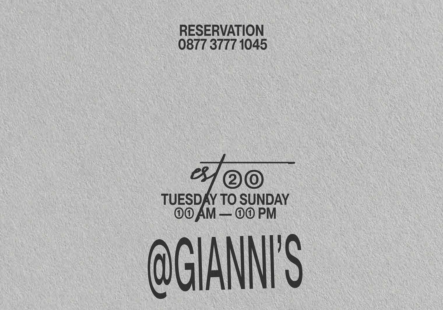
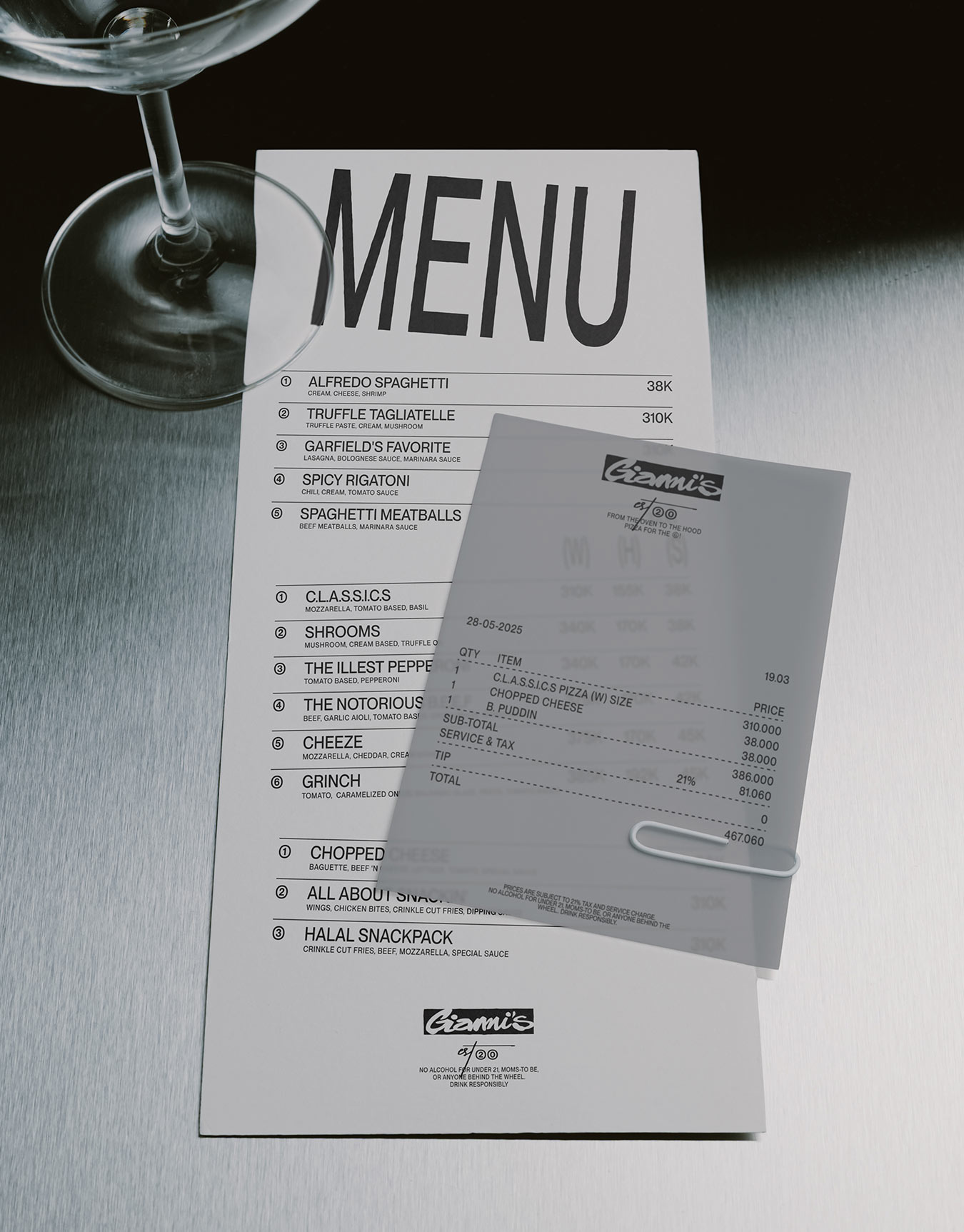
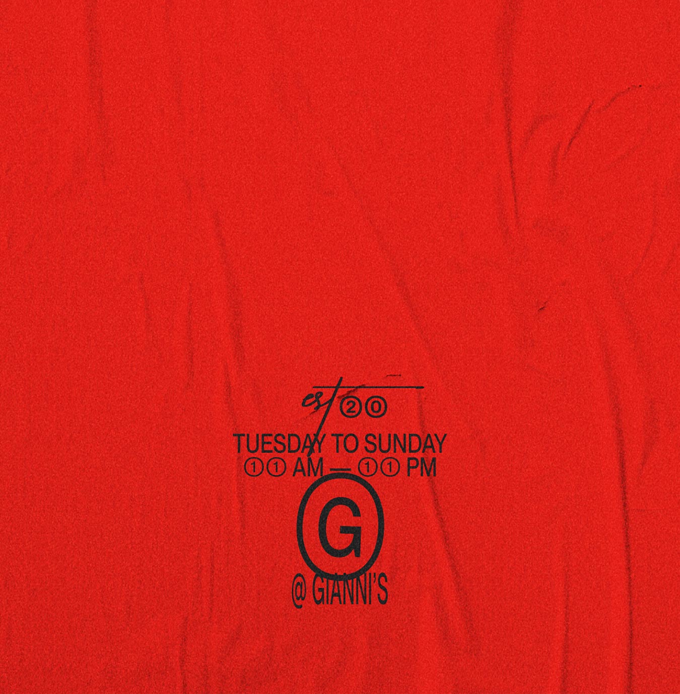
Across menus, packaging, and signage, the bold palette gives Gianni's a consistent presence while the handwritten details keep each application expressive. The identity brings together the energy of the city and the warmth of a neighborhood pizza spot, with food at the center of the story. It's a brand made to feel familiar from the first slice, with enough attitude to stay with you long after the last.

Credits
Mockups
Bendito Mockups, Wannathis
Creative Director
Lewis Webber